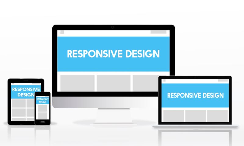
How a Responsive Design Theme Can Transform Your Website Performance Across Mobile, Tablet, and Desktop Devices. The way people access websites has changed dramatically over the past decade. Today, users browse the internet through a wide range of devices, including smartphones, tablets, laptops, desktop computers, and even smart televisions. As mobile traffic continues to account for a significant share of global web usage, website owners can no longer rely on designs that only perform well on large screens. This is where a Responsive Design Theme becomes essential for delivering a consistent and user-friendly experience across every device.
A responsive website automatically adjusts its layout, images, navigation, and content structure to fit different screen sizes without compromising usability. Major search engines such as Google have increasingly prioritised mobile-friendly websites, making responsive design not only a matter of user experience but also an important factor in search engine optimisation (SEO). Businesses that fail to adapt risk losing visitors, engagement, and potential customers to competitors with better-performing websites.
For beginners, the concept of responsive design may seem technical at first, but its purpose is straightforward: ensuring that every visitor enjoys a seamless browsing experience regardless of the device they use. In this guide, we will explore what a Responsive Design Theme is, why it matters in 2026, the key features to look for, and how choosing the right theme can improve website performance, accessibility, and long-term online growth.
How a Responsive Design Theme Can Transform Your Website Performance Across Mobile, Tablet, and Desktop Devices
The digital landscape is no longer a collection of isolated screens. Today, a user might discover your brand via a smartphone during a morning commute, research your services on a tablet during a lunch break, and finally complete a purchase using a desktop computer in the evening. In this hyper-connected ecosystem, a website that fails to adapt seamlessly between these environments is essentially invisible to a vast portion of its potential market.
The key to navigating this multi-device world lies in a unified approach to web development. Rather than building and maintaining separate, clunky iterations of your digital presence for different screens, modern strategy demands flexibility. A single, fluid architecture that intelligently reshapes itself to fit any screen size is no longer an optional luxury or a minor design upgrade; it is the absolute foundation of successful digital marketing and technical search engine optimization (SEO).
With search engines placing unprecedented emphasis on how websites behave on smaller screens, the layout choices you make have a direct impact on your bottom line. Transitioning to a modern, adaptive framework is the most effective way to protect your organic visibility, lower technical maintenance costs, and provide a frictionless experience that turns casual visitors into loyal clients.
Maximising Visibility Under Google’s Global Mobile-First Indexing
Google officially finalised its global transition to mobile-first indexing, meaning the search engine evaluates and ranks your entire website based primarily on its mobile version. If your desktop site is flawless but your mobile layout drops content, hides navigation, or forces users to pinch-and-zoom, your visibility across all search results will plummet. Implementing a high-performance how a responsive design theme layout ensures complete parity between devices, protecting your hard-earned rankings.
Default Crawler Alignment: Googlebot Smartphone is now the default crawler for web indexing, assessing your layout structure, metadata, and body text exactly as a mobile user would see them.
Absolute Content Parity: An adaptive layout guarantees that all text, structural headlines, internal links, and structured schema data remain identical across mobile, tablet, and desktop viewports, preventing indexing blind spots.
Elimination of Redirection Errors: Unlike separate mobile URLs (like m.example.com), a single fluid layout eliminates complex redirect configurations that can drain your crawl budget and cause indexation errors.
Rich Snippet Retention: Structured schema markup is read directly from the mobile-rendered document, ensuring your site remains eligible for lucrative featured snippets and rich search results.
Mastering Core Web Vitals and Page Speed Metrics
User patience is at an all-time low, and search engines actively penalise slow, unstable websites. Modern responsive templates are engineered from the ground up to pass Google’s Core Web Vitals, which measure loading speed, interactivity, and visual stability. By using a lightweight, responsive framework, you eliminate bloated scripts and ensure that your web pages load instantly, whether a user is on a blazing-fast desktop fibre connection or a spotty 4G mobile network.
Largest Contentful Paint (LCP) Optimization: Advanced frameworks prioritize critical CSS and use adaptive image execution to render the main page content in under 2.5 seconds.
Interaction to Next Paint (INP) Control: By removing heavy, unnecessary JavaScript frameworks, a clean fluid theme maintains snappy responsiveness to user clicks and taps, keeping INP well under the 200ms threshold.
Cumulative Layout Shift (CLS) Prevention: Modern layout engines reserve exact dimensions for media and elements dynamically, preventing annoying content jumps as assets load on different screens.
Mathematical asset scaling: Utilising modern CSS units like viewport width (vw) allows typography and spacing to scale smoothly without forcing the browser to recalculate heavy layout trees.
Elevating the Multi-Device User Experience (UX)
A truly successful website feels custom-built for the specific device the visitor is holding. A desktop user relies on a precise mouse cursor, while a mobile user navigates with their thumb. A high-quality how a responsive design theme bridges this gap effortlessly, restructuring navigation menus, scaling form fields, and adjusting interactive elements to provide an intuitive, frustration-free experience across all devices.
Thumb-Friendly Navigation: Touch targets and buttons are automatically scaled to a minimum of 44×44 pixels with ample spacing to eliminate accidental misclicks on compact smartphone screens.
Fluid Grid Adjustments: Multi-column desktop structures seamlessly collapse into elegant, scannable single-column layouts on mobile viewports without truncating vital text.
Streamlined Data Input: Contact and checkout forms scale dynamically to match screen width, triggering the appropriate digital keyboards (numeric, email) on mobile devices for seamless data entry.
Legible Typography Scaling: Text sizes adjust proportionally across devices using relative units (em or rem), maintaining perfect hierarchy and readability without requiring manual layout zoom.
Driving Conversion Rates and Enhancing Business Growth
Your website is your primary digital storefront, and friction is the ultimate enemy of conversions. If a tablet or mobile user struggles to find your call-to-action buttons or faces a broken checkout page, they will abandon your site for a competitor. A seamless, responsive architecture creates a smooth, continuous path from initial discovery to final conversion, maximizing the return on investment (ROI) for your digital marketing campaigns.
Unified Marketing Funnels: Marketing campaigns send traffic to a single, universally optimized URL, ensuring an identical, persuasive brand experience regardless of the visitor’s hardware choice.
Frictionless E-Commerce Checkouts: Shopping carts and payment gateways adapt perfectly to small viewports, allowing for one-touch mobile payments that significantly reduce cart abandonment rates.
Strategic CTA Placement: Crucial conversion elements and contact buttons remain prominently visible and easily clickable, shifting dynamically to optimal screen positions depending on the device.
Reduced Digital Bounce Rates: Providing an immediate, visually stunning, and fast-loading interface captures user attention instantly, keeping them on your site longer and encouraging deeper exploration.
Quantitative Performance and Architecture Comparison
To fully understand the commercial impact of migrating from an outdated, fragmented web setup to a modern, fluid architecture, it helps to examine the technical data. The table below outlines how a modern how a responsive design theme compares to traditional m.dot separate mobile setups and non-optimized legacy platforms across critical performance, operational, and SEO benchmarks.
Frequently Asked Questions
What is the core difference between a responsive theme and a mobile-friendly website? A mobile-friendly website is a fixed layout that is merely scaled down to fit a smaller screen, often resulting in tiny text and unclickable links. A truly responsive theme uses a fluid grid system and dynamic CSS media queries to completely restructure, resize, and optimize the content automatically for every individual screen resolution.
Will switching to an adaptive layout fix all of my website’s speed and performance issues? While a responsive framework provides the structural foundation for fast rendering and clean layout stability, it must be paired with asset optimization. To fully pass Core Web Vitals, you must also compress imagery into next-gen formats (like WebP or AVIF), leverage efficient browser caching, and minimize heavy render-blocking scripts. How does a unified web architecture impact my ongoing digital marketing budgets? It significantly improves your marketing efficiency. Instead of running separate, costly campaigns for mobile and desktop audiences or managing split analytics data, you drive all traffic to a single set of URLs.
This consolidates your authority, lowers tracking complexity, and ensures a consistently high conversion rate across all paid and organic channels. Is it necessary to completely rebuild my existing website to make it responsive? In most cases, retrofitting an ancient, rigid website with modern responsiveness is inefficient and prone to technical glitches. The most reliable and cost-effective approach is to migrate your content onto a modern, responsive framework or theme that has been engineered from the ground up to support fluid layouts and Core Web Vitals optimization.
How do fluid layouts handle complex elements like data tables and multi-tier menus? Modern responsive frameworks use advanced CSS layouts (such as Flexbox and CSS Grid) to handle complex assets. Large data tables are automatically transformed into swipeable, horizontally scrollable cards or responsive charts, while sprawling desktop mega-menus collapse into clean, thumb-accessible mobile navigation structures.
Conclusion
How a Responsive Design Theme Can Transform Your Website Performance Across Mobile, Tablet, and Desktop Devices
The digital marketplace leaves no room for rigid, outdated web structures. As user behavior firmly cements itself in a multi-screen reality, and search engines enforce strict mobile-first performance parameters, your choice of website architecture dictates your market survival. Relying on a legacy framework or a fragmented desktop-only setup is a direct route to declining search rankings, frustrated visitors, and lost revenue.
Transitioning your digital infrastructure to a modern responsive design theme is a strategic evolution. By unifying your content under a single, fluid layout, you align your business perfectly with modern search algorithms, master critical web performance metrics, and deliver an immaculate, frictionless user experience on every device. The result is a highly crawlable, visually stunning, and commercially efficient digital powerhouse that builds trust and drives growth.
If your current digital presence is holding your business back with slow mobile loading times, broken layouts, or dropping conversion rates, it is time to upgrade. Let the specialists at Anavrin Media rebuild your web presence into an optimized, high-performance asset. Explore our cutting-edge design services today by visiting Anavrin Media to unlock your website’s true potential across mobile, tablet, and desktop devices.

Anavrin Media Team is a group of writers, researchers, and editors focused on delivering high-quality content across digital marketing, advertising, SEO, SEM, affiliate marketing, content creation, email marketing, social media strategy, video marketing, programming, and online events. Through in-depth research, industry analysis, and practical insights, we help professionals, entrepreneurs, marketers, and creators navigate the latest trends, tools, and opportunities in the digital economy.